


At Art of Key, branding is more than a service—it’s a signature, a story, and most of all, a key. Our identity isn’t a mere arrangement of visuals or a clever play on words; it is a deeply rooted philosophy.
At Art of Key, branding is more than a service—it’s a signature, a story, and most of all, a key. Our identity isn’t a mere arrangement of visuals or a clever play on words; it is a deeply rooted philosophy.
Drawing inspiration from our Hungarian foundations, every element—from our logotype and color palette to our typography and geometric motifs—carries a clear mission: to ensure that every touchpoint of our communication remains true to the values we believe in, namely quality service, transparency, and proactivity.

The central symbol: the Key
In our name, the Key stands as the central metaphor—symbolizing the key to unlocking growth, opportunity, and creativity. This idea guides every visual and strategic decision we make. Just as a well-crafted key opens a door to new possibilities, our brand identity is designed to unlock the full potential of every brand we partner with. We believe every brand holds a locked door, and our role is to create that perfect key to open it—strategically, creatively, and meaningfully.
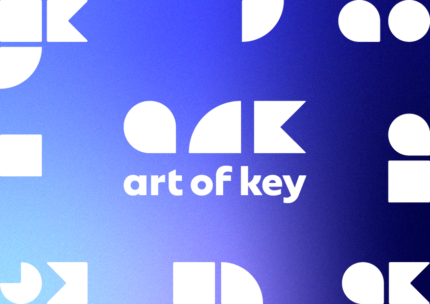
Logotype – the brand’s heart
Our logotype is not simply a graphic element; it is the heart of our brand. Constructed in a stable, rectangular form, it conveys professionalism, reliability, and the importance of collaboration. This design is carefully optimized to appear flawless in both black and white versions, ensuring consistency whether placed against light or dark backgrounds. The bold geometry of our logo echoes the key concept, reinforcing that first impression with strength and precision.
Color palette – strategic, meaningful tones
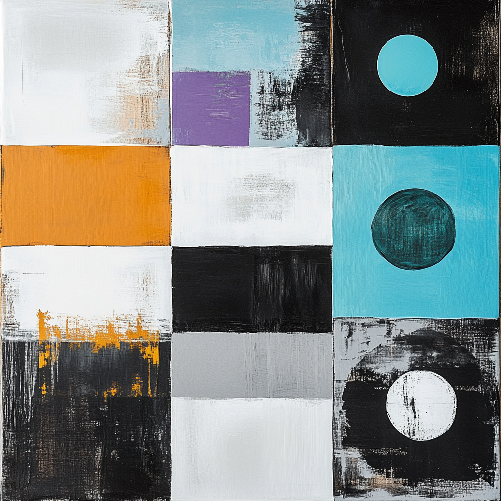
Color is not mere decoration—it is our language. The primary color palette of Art of Key is deliberately selected to instill a sense of unity, stability, and timelessness. We employ classic black and timeless white as the foundational tones, which communicate clarity and balance. Complementing these are greyish turquoise, pale silver grey, and warm pale brown. Together, these shades create an atmosphere of trust and professionalism while also emphasizing innovation and freshness. Secondary colors are thoughtfully introduced as accents in digital and print designs, adding dynamic and exciting nuances that elevate emotional connection and brand depth.
Typography – clarity meets creative expression
Typography is the audible voice of a visual identity, and ours is both confident and clear. We have chosen the Natom Pro typeface family for its defined lines and excellent legibility. Whether in extra bold, medium, or thin styles, this font helps us establish a clear hierarchy in our content, ensuring that our message is consistently communicated. This careful choice reinforces our role as both strategic thinkers and imaginative creators, maintaining clarity while allowing creative expression to flourish.
Geometric forms & visual motifs – dynamic and fresh
Beyond the essentials of logo, color, and type, our identity is enriched by additional geometric shapes and patterns. These visual motifs are the building blocks of our unique brand language, creating dynamic, sometimes even three-dimensional effects that are both modern and eye-catching. They work in harmony with our core elements to produce visual rhythms that guide the viewer’s eye—while never detracting from the main message. Our designs maintain a delicate balance between structure and creativity, ensuring that every design reflects our ongoing commitment to innovation without losing focus on clarity and direction.
Symbolism – more than a mere metaphor
At Art of Key, the key is not a simple background symbol; it is the soul of our identity. It represents the access we provide—to markets, audiences, and the limitless realm of creative potential. This symbolism is deeply embedded in every decision we make, from the layout and interaction design to the way we speak to our partners. Our commitment is to always find the right fit for every unique challenge, rather than offering generic solutions.
Tone of voice – strategic, confident, and inspiring
Just as our visuals speak the language of the key, our tone of voice is designed to be confident yet inviting. We communicate with a clarity and assurance that mirrors the precision of our design elements. Whether in written or spoken word, our messaging is assertive without being aggressive, strategic yet creative—ultimately designed to unlock ideas and propel momentum. This tone reinforces our belief that a brand’s narrative must be as compelling as its design.

A living identity
Every element of the Art of Key brand identity has been meticulously developed to form an integrated, unified system. Our visual identity, as detailed in our brandbook, is treated not as an afterthought, but as the living, breathing soul of our brand. It is crafted to remain consistent across all platforms, ensuring that every client and partner immediately recognizes not just a company, but a vibrant community dedicated to the highest standards of quality and creative thinking.
In today’s market, where brands have to be flexible, aesthetics alone do not suffice. A successful brand identity must resonate with core values, create strong connections, and lead with unwavering clarity.
At Art of Key, our design and philosophy work hand in hand to build identities that are not only seen, but truly understood, remembered, and trusted—because they are built on the key to unlocking endless potential.
